html TIMBR Logo – Case Study | FIMOGRAFIKA
TIMBR logo
Logo

TIMBR logo

Project
TIMBR logo – image 1

A premium brand mark for wood shaped by fire

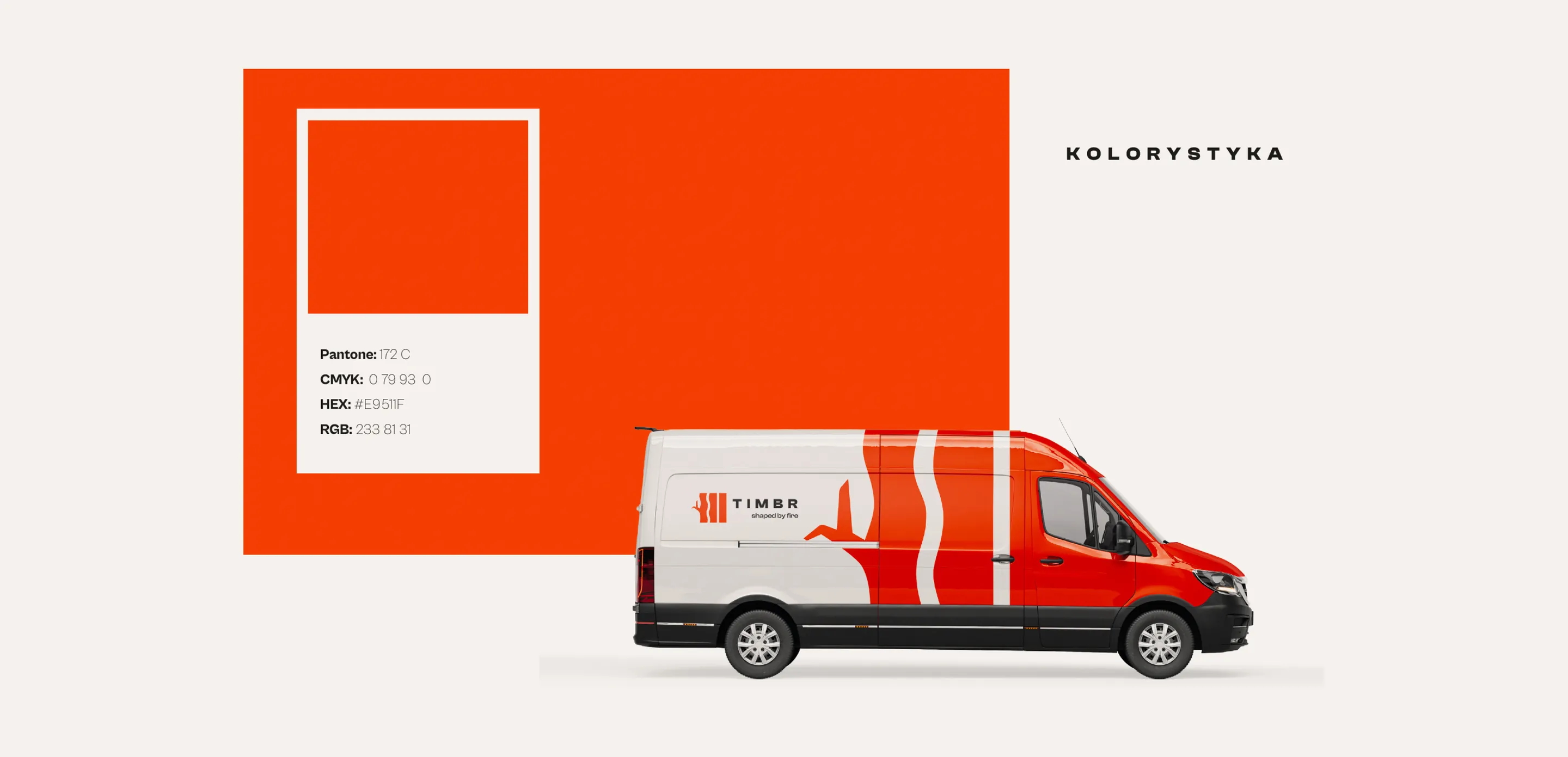
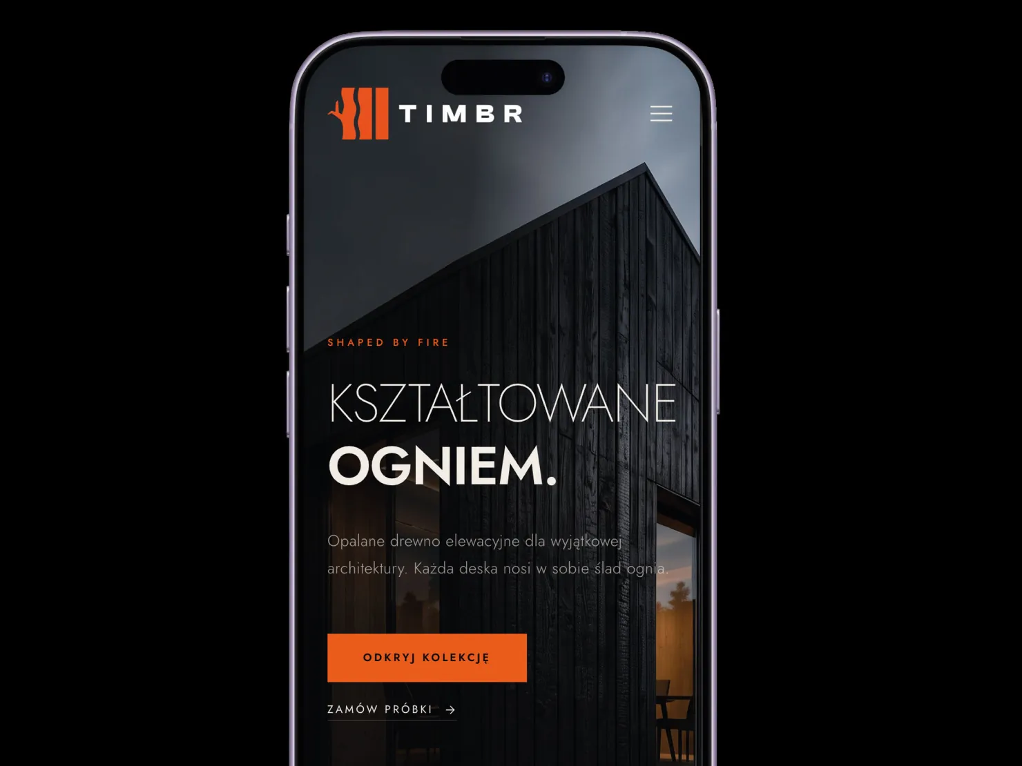
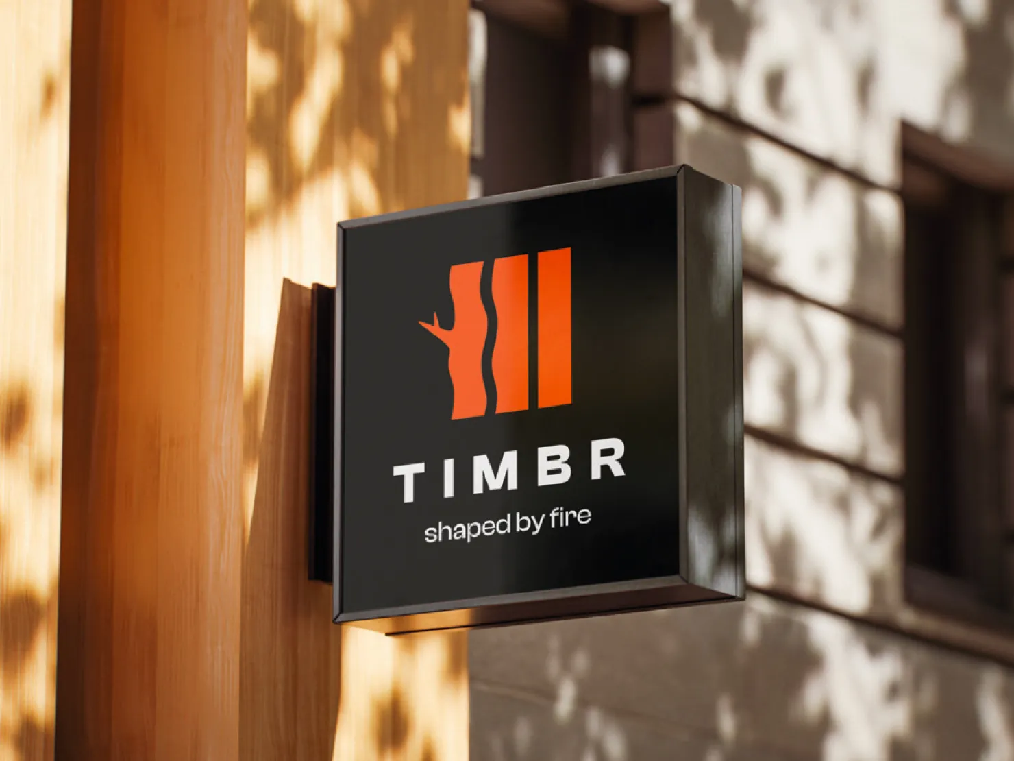
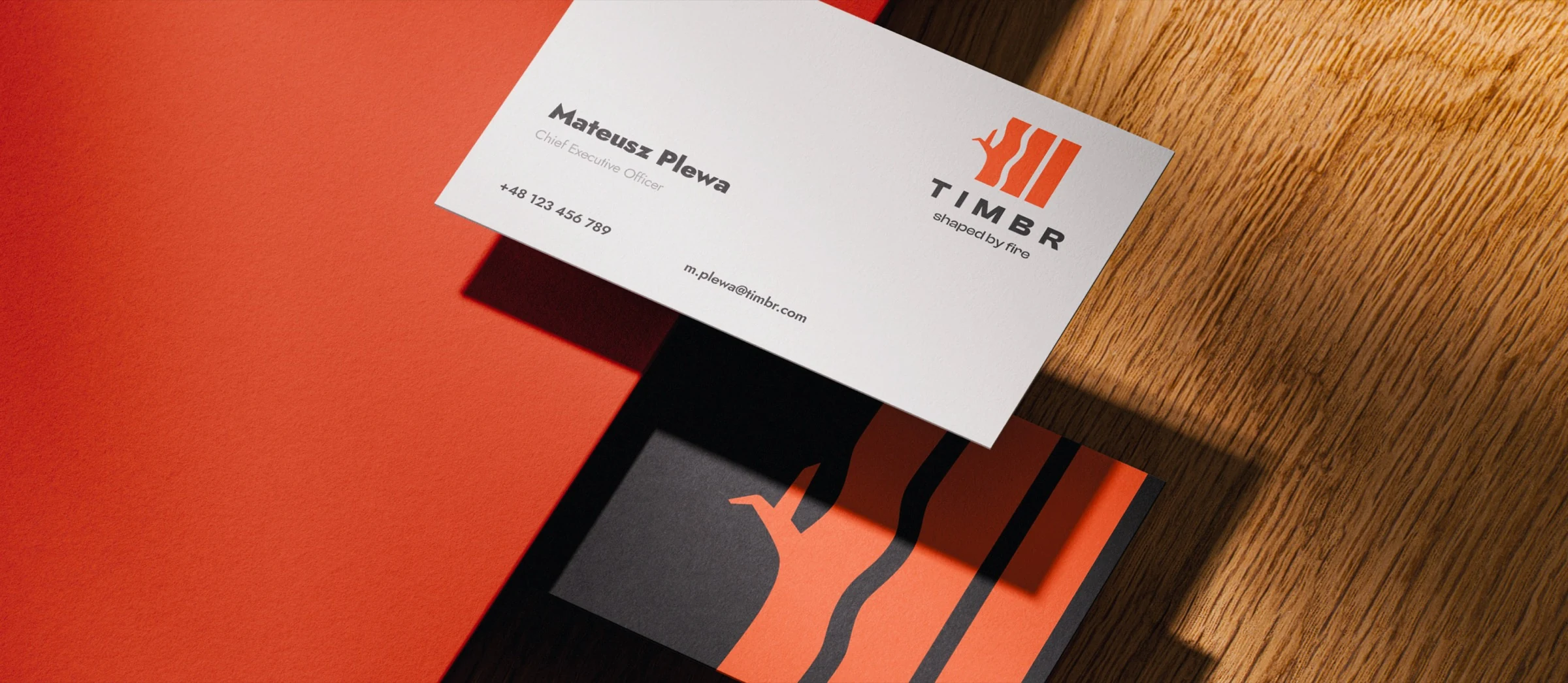
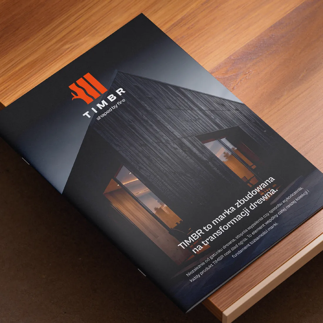
TIMBR is a new brand of luxury architectural materials made from natural wood: cladding, slats, soffits, decking and interior materials. Every product undergoes controlled fire treatment – from subtle charring to deep carbonisation inspired by the Japanese Shou Sugi Ban technique. I designed the brand's logo: a symbol, a wordmark with the “shaped by fire” tagline and logo usage rules. I presented the logo in mock-ups – business cards, a catalogue, a sign, a website and a company van – so the client could see right away how the mark performs in real applications.

Client

TIMBR – shaped by fire

Year

2026

Scope of work

  • symbol and wordmark design
  • logo versions: primary, horizontal, with and without tagline
  • colour and monochrome versions
  • brand colour and logo typeface
  • logo usage rules and mock-ups

Service: logo design
Process

From challenge to finished project.
Challenge

TIMBR is entering a market where most manufacturers simply sell boards and compete on price. The client wanted the opposite: a premium brand that impresses from the first contact and earns the trust of architects, interior designers and discerning investors. The logo had to be calm, elegant and timeless – nothing loud, no “foresty” or rustic feel, not overly industrial and no serif fonts. At the same time it had to show what unites the whole collection: every TIMBR product bears the mark of fire.

Goal

To design a recognisable mark that positions TIMBR as an expert in fire-treated wood rather than just another manufacturer. The logo had to be simple and legible at any size – from a website icon to a façade, catalogue, sample kit and vehicle wrap – and become the foundation for the rest of the brand identity.

Solution

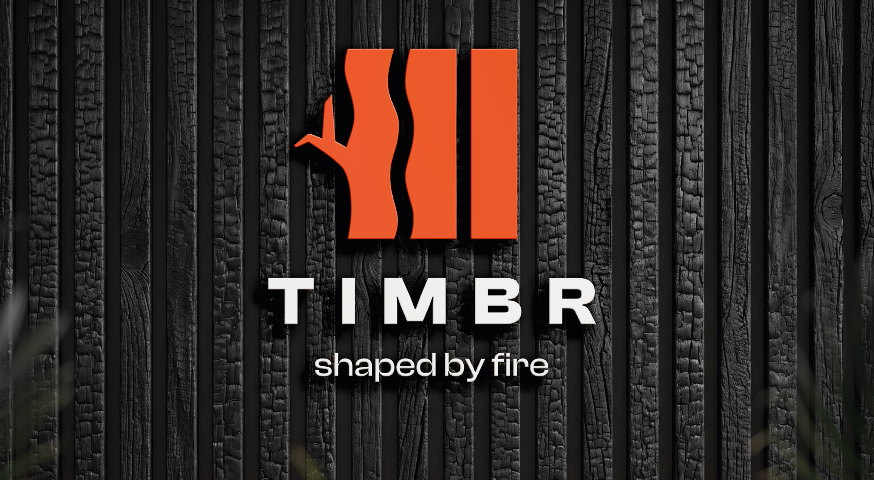
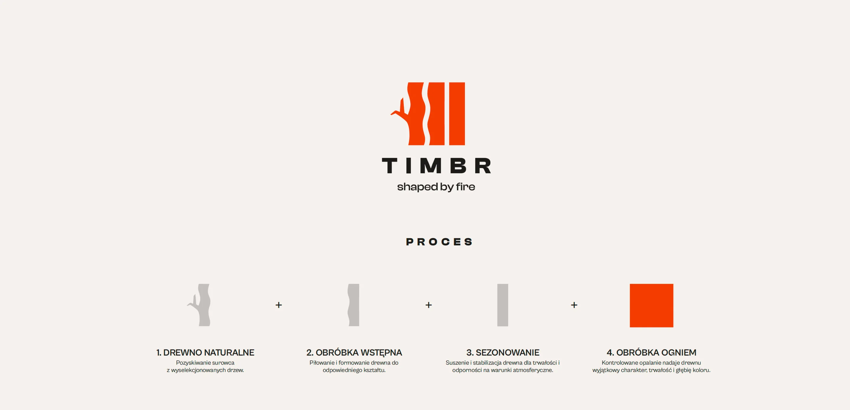
I built the symbol from three vertical boards. The first turns into a stylised trunk with a branch, and the wavy edges evoke both wood grain and tongues of flame – the mark tells the story of how the product is made. It is complemented by a geometric, widely spaced TIMBR wordmark and the “shaped by fire” tagline set in the sans-serif Cabin Grotesk. The brand colour is a fiery orange (Pantone 172 C), which stands out most on the black of charred wood and on off-white. I prepared primary and horizontal versions, with and without the tagline, in colour and in black and white, plus usage rules: clear space and examples of prohibited changes.

You're one step away from a great decision.  Book a call or give me a ring.

Call me
+48 606 794 816